Plotting wave functions and density operators
This web page can be downloaded as notebook: plotting.ipynb (Jupyter)
or plotting.md (Markdown)
Basics of plotting with Matplotlib
The standard for plotting under Python is Matplotlib, see https://matplotlib.org for the full documentation. However, while Matplotlib is powerful and flexible, it does not behave uniformly in all environments. Before we plot any wave function, we should therefore get a simple line plotted first.
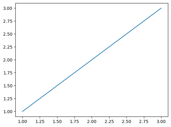
Consider the following code
import matplotlib.pyplot as plt

figure, axes = plt.subplots()
axes.plot([1, 2, 3], [1, 2, 3]);
A figure is a widget on which things can be drawn. It can contain one or more axes, which are the actual plotting areas.
What happens if you execute this code?
Jupyter notebooks implicitly show all figures when a cell is executed, so you see a plot. However, once a figure is shown, it becomes read-only, so you must produce the plot in one go inside a cell, and you must use a new figure in each cell.
Under a Windows e.g., command line, you do not see a plot. You need to add an explicit
figure.show()to open a new window containing the plot display.Under Linux when, say, running Python in an xterm, you do not see a plot. And you only get an empty window when typing
figure.show(). Now it becomes interesting:You need to show the figure and add an event loop to get the plot displayed. Either type
plt.show(block=True)to block Python execution until the plot window is closed, or typeplt.pause(<pause_in_seconds>)to show the plot for some time before resuming execution. After the pause is over, the plot window stops being updated.Depending on your Python installation, you may get no plot, but a warning about a non-interactive backend. So you need to install an interactive backend.
What should work most of the time is a GTK-based backend. Install PyGObject with
pip install PyGObject. Matplotlib may already use it as default then. If not, set the environment variable,export MPLBACKEND=GTK3Agg. Now you should finally get a plot display.
Other environments, such as PyCharm of VSCode plugins, or macOS may have their own particular behavior.
If you managed to show a simple plot, we can go on plotting real data.
Wavepacket does not handle these behavior differences, so you typically have to show() the plot
after plotting some wave function.
Demo system
For this plotting demo, we use a one-dimensional harmonic oscillator as example system.
import wavepacket as wp

grid = wp.grid.Grid(wp.grid.PlaneWaveDof(-10, 10, 128))

kinetic = wp.operator.CartesianKineticEnergy(grid, 0, mass=1)
potential = wp.operator.Potential1D(grid, 0, lambda x: 0.5 * x ** 2)

psi_0 = (wp.builder.product_wave_function(grid, wp.special.Gaussian(-3, 0, rms=1))
        - wp.builder.product_wave_function(grid, wp.special.Gaussian(3, 0, rms=1)))

equation = wp.expression.SchroedingerEquation(kinetic + potential)
solver = wp.solver.OdeSolver(equation, dt=0.5)
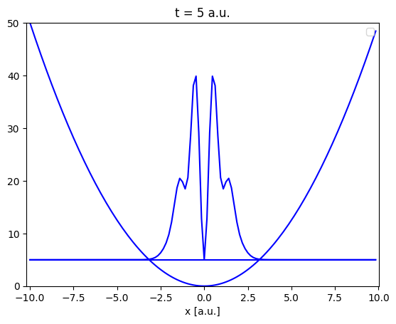
Wavepacket 1D plotting helpers
Wavepacket offers utility classes to make plotting of states easier. These classes are opinionated and may not be as flexible and configurable as you need them. Their sole purpose is a useful visualization of the dynamics with minimal setup. If they do not fulfill your needs, you might want to write your own plotting code, as discussed in the next section.
Since version 0.2, there are two available helper classes: wavepacket.plot.SimplePlot1D just draws one plot,
while wavepacket.plot.StackedPlot1D stacks multiple plots on top of each other.
Otherwise, both classes behave similar; they plot the potential and the state’s density
offset by the energy of the state.
The simple plot provides a simple way to plot animations, while stacked plots are suitable for
Jupyter notebooks, where you can have only one plot per cell.
The wavepacket.plot.StackedPlot1D constructor gets the number of plots, some wave function for guessing defaults, and the
potential and Hamiltonian, then you just call plot repeatedly to fill the individual plots.
If you plot more often than there are axes available, the last plot is overwritten.
stacked_plot = wp.plot.StackedPlot1D(6, psi_0, potential=potential, hamiltonian=kinetic+potential)
stacked_plot.conversion_factor /= 2

for t, psi in solver.propagate(psi_0, t0=0.0, num_steps=5):
    stacked_plot.plot(t, psi)

# stacked_plot.figure.show() or similar is needed outside of Jupyter notebooks
/home/docs/checkouts/readthedocs.org/user_builds/wavepacket/envs/stable/lib/python3.13/site-packages/wavepacket/plot/plot_1d.py:178: UserWarning: No artists with labels found to put in legend.  Note that artists whose label start with an underscore are ignored when legend() is called with no argument.
  axes.legend(loc="upper right")
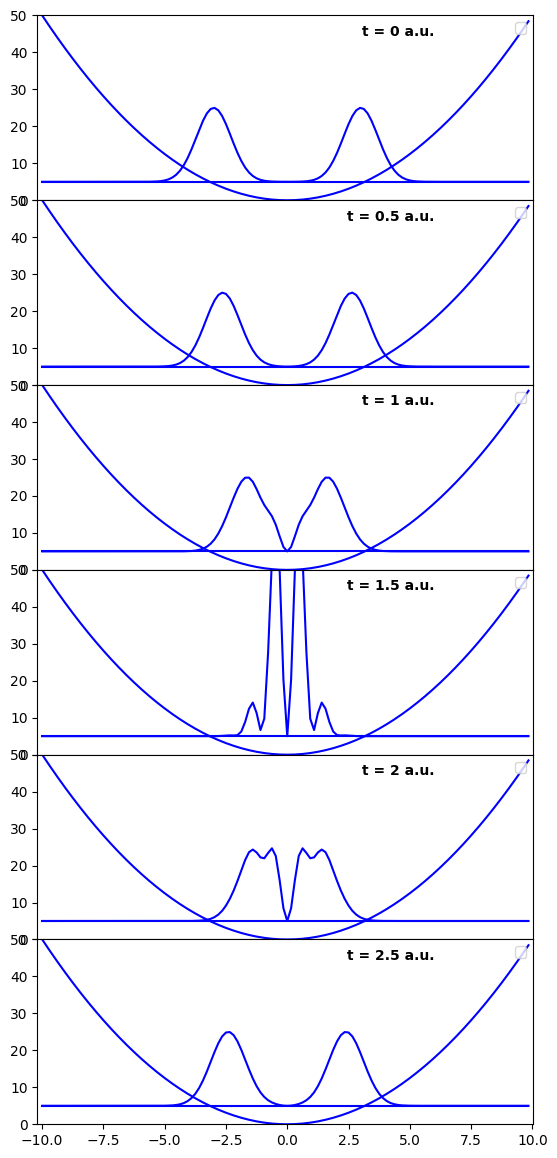
In the example here, we have reduced the density scale (density to energy units), to fit the large spikes on the plot.
Further customization options are stacked_plot.ylim, which gives the lower and upper range of the y (energy) axis,
and the same for the x-axis.
For wavepacket.plot.SimplePlot1D, you do not supply the number of plots, otherwise the behavior is similar.
We will use them further below to demonstrate animations from plots.
2D plotting helpers
Since version 0.4, there are also opinionated helper classes for 2D plots. These helpers create regular and stacked contour plots. Let us demonstrate the stacked plot for a two-dimensional harmonic oscillator example:
import numpy as np

dof = wp.grid.PlaneWaveDof(-15, 15, 128)
grid_2d = wp.grid.Grid([dof, dof])

kinetic_2d = (wp.operator.CartesianKineticEnergy(grid_2d, 0, mass=1.0, cutoff=35)
             + wp.operator.CartesianKineticEnergy(grid_2d, 1, mass=1.0, cutoff=35))
potential_2d = (wp.operator.Potential1D(grid_2d, 0, lambda x: 0.5 * x ** 2, cutoff=35)
               + wp.operator.Potential1D(grid_2d, 1, lambda x: 0.25 * x ** 2, cutoff=35))

equation_2d = wp.expression.SchroedingerEquation(kinetic_2d + potential_2d)

psi0_2d = wp.builder.product_wave_function(grid_2d, [wp.special.Gaussian(-5, 0, rms=1),
                                                     wp.special.Gaussian(-5, -5, rms=1)])

solver_2d = wp.solver.ChebychevSolver(equation_2d, np.pi/5, (0, 140))
plot = wp.plot.StackedContourPlot2D(3, 3, psi0_2d, potential_2d)
for t, psi in solver_2d.propagate(psi0_2d, 0, 8):
    plot.plot(t, psi)
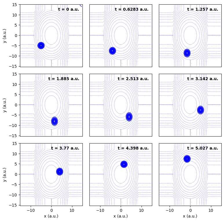
The strange form of the potential comes from truncating the potential for efficiency. The density stays away from the truncated area. This is a nice side effect: We can readily check if the truncation of the potential makes sense.
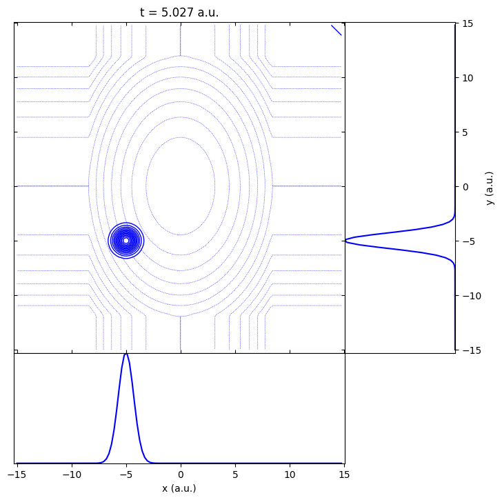
The regular contour plot adds margins to show the reduced densities.
plot_regular = wp.plot.ContourPlot2D(psi0_2d, potential_2d)
plot_regular.plot(t, psi0_2d);
Similar to the one-dimensional plots, some limited customization is possible.
See the class documentation of wavepacket.plot.StackedContourPlot2D and wavepacket.plot.ContourPlot2D for details.
Manual plotting
You need to write your own plotting functions if the default functionality does not cover your use case, or if you need a specific styling, for example for a publication. Doing so is well-supported, but requires deeper access and familiarity with Wavepacket data structures.
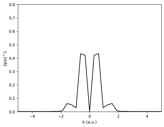
As an example, let us assume you want to plot the density in the plane-wave expansion (the FBR). Ideally, you write a plot function first.
import matplotlib.pyplot as plt

figure, axes = plt.subplots()

def plot_in_fbr(psi):
    # Note: using global variables can be highly problematic,
    # but you often need a lot of different variables for plotting,
    # so we use them instead of function parameters here.
    global figure, axes

    fbr_grid = psi.grid.dofs[0].fbr_points
    fbr_density = wp.fbr_density(psi)
    axes.plot(fbr_grid, fbr_density, 'k-')

    # Magic numbers; basically guesswork to make the plot cover only the interesting area.
    # You want a fixed range for all plots to avoid the plot zipping around.
    axes.set_xlim(-5, 5)
    axes.set_ylim(0, 0.8)

    # Beautification to make the plot look complete.
    axes.set_xlabel("k (a.u.)")
    axes.set_ylabel("|\psi|^2")

    # again, outside of notebooks, you need to add 'figure.show()' or similar here

# Then you plot like
plot_in_fbr(psi_0)
Of course, you can go ahead and plot further states, maybe interpolate to a finer grid etc.
Outside of notebooks, you could recycle this figure and use,
e.g., plt.pause(1), to make a crude animation.
For more complex examples of data plotting, see for example Pendular states.
Saving images and animations to files
To save an image, you can call figure.savefig().
As an example, we can save our stacked plot with
stacked_plot.figure.savefig(f"harmonic_oscillator_stacked.png")
The figure is saved directly from the plotting data without showing the plot, therefore you do not even need an interactive backend.
As mentioned before, you can create crude animations outside Jupyter notebooks by calling plt.pause(1).
This shows the plot and blocks the execution of the Python script for one second.
The matplot.animation package offers other approaches that we will skip here.
At some point, however, showing the animation is not enough,
you want to save it for further processing or demonstration.
For animation export, you create a writer, start saving, and then plot and grab the individual frames. Again, you do not need to show the plot, or even an interactive backend. Because stacked plots are not terribly useful for animations, you should use a simple plot here
from matplotlib.animation import HTMLWriter

simple_plot = wp.plot.SimplePlot1D(psi_0, potential=potential, hamiltonian=kinetic+potential)
simple_plot.conversion_factor /= 2
writer = HTMLWriter(fps=3, embed_frames=True)

with writer.saving(simple_plot.figure, "harmonic_oscillator.html", dpi=200):
    for t, psi in solver.propagate(psi_0, t0=0.0, num_steps=10):
        simple_plot.plot(t, psi)
        writer.grab_frame()
/home/docs/checkouts/readthedocs.org/user_builds/wavepacket/envs/stable/lib/python3.13/site-packages/wavepacket/plot/plot_1d.py:178: UserWarning: No artists with labels found to put in legend.  Note that artists whose label start with an underscore are ignored when legend() is called with no argument.
  axes.legend(loc="upper right")
The animation is written to disk as soon as the block enclosed with “with” is left.
The HTMLWriter by default creates an HTML page consisting of the individual
frames as png files and some JavaScript to play the animation.
In the example, we reduced the playback rate to 3 frames per second, and embedded the images
into the HTML due to document generator constraints.
This robust approach should generally work, and the result is suitable for embedding in a web page.
Matplotlib also offers other writers, for example, FFMpegWriter.
These are more flexible, but require additional prerequisites such as an installed FFmpeg.